15 Famous Logos and the Brands Behind Them
Some logos do not need words. The Nike swoosh, the Apple bite, the golden arches at McDonald’s. You see them and you know exactly what they stand for. That is the power of famous logos done right.
But here is what most people miss: behind every iconic mark, there is usually a branding agency that spent months (sometimes years) crafting it. These agencies do not just draw pretty pictures. They build meaning, shape culture, and turn small ideas into billion-dollar identities.
So if you have ever wondered who actually creates the world’s most famous brand logos, this listicle is for you. We have rounded up 15 iconic marks that have shaped how we recognize the world’s biggest brands, starting with WANT Branding’s refresh of Royal Caribbean and moving through some of the most studied logos in design history. For each one, you will get the story behind the logo and the agency responsible for it.
1. Invited Clubs Logo by WANT Branding

For years, ClubCorp was one of the most established names in private golf and country clubs. But its legacy of exclusivity no longer reflected the warmer, more connected experience members wanted. The company needed more than a refreshed logo. It needed a new name, identity, and story.
That transformation became Invited. Working with WANT Branding, ClubCorp shifted from a brand built around private membership to one centred on warmth, connection, and modern hospitality. The new name captured the feeling the company wanted to create: a place where people feel welcomed, included, and part of something bigger.
That work is exactly what you would expect from a leading brand creation agency with more than 25 years of experience building category-defining brands. Cisco, Mercedes-Benz, Nissan, Citi, HP, ServiceNow, Uber, and POLITICO all sit alongside Invited on the WANT Branding client roster.
Most studios treat naming and visual identity as separate disciplines. WANT does not. A category-defining name and a bold, modern logo are part of the same story. Recent projects like Outshift by Cisco, NeuReality, REEF, Sequoia Heritage, MMGNET Group, Vanteo, AllRecruit, Invited, and Myhibbin all came out of that integrated process.
The portfolio has been recognized accordingly. WANT’s Invited work earned gold at the MUSE Creative Awards, plus silver and bronze at the Transform Awards. As a top branding agency for businesses navigating change, WANT delivers four connected capabilities: brand naming,brand creation and refresh,brand strategy, and brand insights.
2. The FedEx Logo by Landor
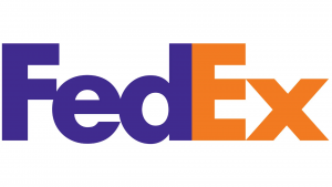
The FedEx wordmark looks deceptively simple, just five letters in purple and orange. But hidden inside that geometry is one of the most famous design easter eggs in the world. Look between the “E” and the “x” and you will see a perfect white arrow pointing forward. It is a quiet visual promise of speed and forward motion, baked into the negative space.
The mark was designed in 1994 by Lindon Leader at Landor (now Landor & Fitch). The firm was founded by Walter Landor in 1941, literally aboard a ferryboat in San Francisco Bay, and has gone on to shape famous company logos for BP, Cathay Pacific, GE, and Procter & Gamble. The FedEx arrow has collected more than 40 design awards since launch and remains one of the most studied examples of how negative space can carry brand meaning. Few logos do so much with so little.
3. The NBC Peacock by Chermayeff & Geismar & Haviv
The NBC peacock has been around in some form since 1956, when it was introduced to promote the network’s color broadcasting. The version most people know today, with six feathers fanning out from a central body, was designed in 1986 by Steff Geissbuhler at Chermayeff & Geismar. The studio has refined it again in the years since, but the core idea has stayed intact for nearly four decades.
The firm itself is a New York institution. Founded in 1957 by Ivan Chermayeff and Tom Geismar, and now led with partner Sagi Haviv, the studio has produced some of the most enduring corporate marks in the world. The Chase bank octagon, the Mobil red O, the National Geographic yellow rectangle, the PBS profile, and the Showtime mark all came from this team. Few studios have a strike rate like this one.
4. The Mastercard Logo by Pentagram
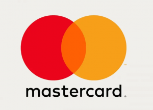
The two interlocking circles of the Mastercard logo, one red and one yellow, have been recognizable since 1968. But the 2016 redesign by Pentagram is what made the mark feel modern. Partner Michael Bierut stripped away the gradients, the drop shadows, and the textured wordmark stretched across the middle, leaving behind a flat, confident pair of overlapping circles. In 2019, Mastercard took the next step and removed the wordmark entirely, becoming one of the only global brands confident enough to operate as a pure symbol.
Pentagram is unusual among large design firms. Founded in London in 1972, it operates as a partnership of around 25 designers, each running their own studio under one banner. Citi, Slack, Verizon, Saks Fifth Avenue, and the Co-op all carry Pentagram fingerprints alongside Mastercard.
5. The Walmart Spark by Lippincott
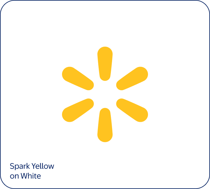
Before 2008, Walmart’s logo was an all-caps blocky wordmark with a star between “WAL” and “MART.” It looked like a discount-store sign from the 1980s, because that is exactly what it was. Lippincott’s 2008 redesign softened the wordmark into a friendlier lowercase font and added the now-famous yellow spark, a six-pointed sunburst meant to feel like the moment of inspiration the brand wanted to spark in shoppers.
Lippincott has been doing this kind of work since 1943, making it one of the oldest and most influential branding agencies in the world. The New York firm has also created or refreshed logos for Coca-Cola, Campbell’s Soup, Betty Crocker, eBay, Hyatt, and Delta. When a Fortune 500 brand commits to a full identity overhaul, Lippincott is almost always on the shortlist.
6. The London 2012 Olympics Logo by Wolff Olins
Few logos have ever been as divisive as the London 2012 Olympics mark. Designed by Wolff Olins in 2007, the jagged, pink-magenta interpretation of “2012” looked nothing like the polished Olympic logos that came before it. Critics called it ugly. Petitions were filed. But the mark was built to flex across digital, motion, and youth-targeted media, and by the time the games actually opened, it had become a defining image of the event.
Wolff Olins was founded in London in 1965 and now has offices in New York and San Francisco. The firm is known for pushing branding into bold, sometimes controversial territory. The studio also designed the elegant GE monogram, the Aol. punctuation rebrand, and identity systems for Uber, Tesco, and the Tate galleries.
7. The Mailchimp Logo by COLLINS
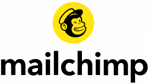
The Mailchimp identity is built around Freddie, a winking, hand-drawn chimp head that has been part of the brand since 2008. The 2018 redesign by COLLINS reworked Freddie into a flexible, fully-owned character, paired it with the chunky Cooper Light wordmark, and committed to a yellow so loud it could not be ignored. The launch helped Mailchimp shed its image as a small-business email tool and reposition itself as an all-in-one marketing platform.
COLLINS is a smaller independent agency based in San Francisco and New York, founded by Brian Collins. Its work tends to be playful, expressive, and unmistakably modern, which has made the studio a favorite for tech brands trying to feel more human. Spotify, Twitch, Robinhood, and Dropbox have all turned to COLLINS for identity work.
8. The Burger King Logo by Jones Knowles Ritchie
For two decades, Burger King wore a glossy blue-and-orange logo with a chunky 3D bun wrapping around the wordmark. It looked dated, and customers noticed. In 2021, the brand turned to Jones Knowles Ritchie for a full refresh. The agency went backwards in time, pulling the chain’s 1969 mark out of the archives and reissuing it with cleaner curves, richer color, and a custom typeface called Flame. The bevels and gradients were gone. The new logo felt fresher precisely because it was older.
JKR is a London-based agency with offices in New York and Shanghai, and it has become the go-to studio for food and beverage brands. Beyond Burger King, the firm has refreshed identities for Budweiser, Dunkin’, Oatly, and Mars. The Burger King rebrand alone collected Cannes Lions and D&AD awards.
9. The Airbnb Bélo by DesignStudio
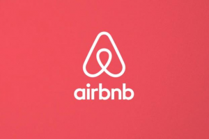
When DesignStudio unveiled the Airbnb Bélo in 2014, the internet had opinions. The looping shape was meant to represent four ideas at once (people, places, love, and Airbnb itself), but early critics joked it looked like other, less polite things. A decade later, those jokes are gone and the Bélo is recognized as one of the most distinctive tech logos of the era. It scales cleanly from app icons to airport signage and has become a genuine symbol of the sharing economy.
DesignStudio was founded in London in 2009 and now has offices in New York and Sydney. The studio’s process is research-heavy. The team typically spends weeks immersed in a client’s world before sketching a single mark, which has earned them work with Deliveroo, the Premier League, Twitch, and Logitech.
10. The Volkswagen Logo by MetaDesign
Volkswagen’s interlocked “V” and “W” inside a blue circle has been around since the 1930s, and MetaDesign has been the firm most associated with shaping its modern look. The Berlin-based agency has worked on Volkswagen’s corporate identity system for decades, defining the brand standards, typography, and visual rules that govern how the logo shows up across dealerships, manuals, vehicles, and digital products around the world. When the 2019 flat redesign pulled chrome and shadow out of the mark for an electric era, it sat on top of that same MetaDesign foundation.
MetaDesign was founded in Berlin in 1979 and has long been associated with thoughtful, systems-driven identity work. The firm has also shaped identity systems for Audi, Lufthansa, and Adobe. That German engineering sensibility shows up in the structure of the work. MetaDesign tends to deliver identities that scale across thousands of touchpoints without falling apart.
11. The American Airlines Logo by FutureBrand

American Airlines wore the same Massimo Vignelli logo for 45 years. The double “AA” with the eagle between them was considered untouchable in design circles. So when FutureBrand was asked to redesign it in 2013, the team had every reason to be nervous. The new mark kept the red, white, and blue palette and held onto the eagle as a stylized flight symbol, but everything else was rebuilt. The result is a sleeker identity that has weathered a decade of brand scrutiny and now feels like the natural successor to Vignelli’s original.
FutureBrand operates as a global brand consultancy with offices in 15 cities. The firm has designed or refreshed identities for Nespresso, UPS, and Porsche, among many others. What makes FutureBrand stand out is its emphasis on what the team calls “future experiences.” The agency does not just design logos. It maps how a brand will show up across every customer touchpoint over the next decade.
12. The AIIB Logo by Saffron Brand Consultants
The Asian Infrastructure Investment Bank is a Beijing-headquartered multilateral lender with members across more than 100 countries. When the bank needed an identity that could work across languages, scripts, and cultures, Saffron Brand Consultants built one around a stylized geometric mark that nods to architecture and growth at the same time. The logo had to perform in Chinese, Arabic, Cyrillic, and Latin contexts, which is exactly the kind of design constraint most agencies never have to think about.
Saffron was founded by Wally Olins (the same Olins from Wolff Olins) in 2001. The firm operates from Madrid, London, Vienna, and Mumbai, with a particular strength in nation branding and large-scale infrastructure projects. Vueling Airlines and the country of Poland have both turned to Saffron for identity programs that have to perform across geographies.
13. The AT&T Globe by Interbrand
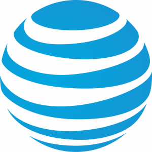
The current AT&T globe, that striped sphere often paired with the lowercase “at&t” wordmark, was redesigned by Interbrand in 2005. The original AT&T mark was a Saul Bass classic from 1983, but when SBC Communications acquired AT&T and adopted the name, the brand needed an identity that could carry it into the broadband and mobile era. Interbrand kept the heritage globe shape and added depth and motion to make it feel ready for screens.
Founded in 1974 in London, Interbrand pioneered the idea that brand value can actually be measured in dollars. The firm publishes the Best Global Brands report every year, which has become an industry benchmark. Beyond AT&T, the agency has worked with Microsoft, Samsung, Audi, and Nissan on identity systems that need to flex across products, regions, and digital platforms.
14. The HP Identity System by Moving Brands
Hewlett-Packard’s logo has gone through several iterations, but the most influential modern version came from Moving Brands in 2008. The proposed identity, a simplified angular “hp” monogram inside a tilted square, was designed to give the technology brand a single, flexible mark for the digital era. HP eventually adopted a different public-facing logo, but the Moving Brands system reshaped how the company thought about identity at scale and is still studied as a landmark case in tech branding.
Moving Brands was founded in London in 1998 and now operates from San Francisco and New York. The firm specializes in tech, finance, and lifestyle brands that need to flex across digital products and motion-heavy environments. Work for Swisscom, early Netflix, and Sony Music has shaped how those companies show up online. The studio is particularly strong at motion design, which makes it a frequent partner for software companies launching new products.
15. The 3M Wordmark by Siegel+Gale
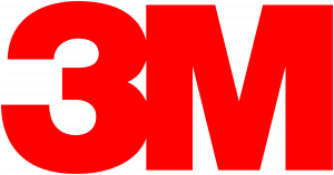
3M is one of the most ubiquitous brands in the world. You have almost certainly used a Post-it Note, a piece of Scotch tape, or an N95 mask without thinking about who made it. The clean red sans-serif wordmark behind all of those products was simplified by Siegel+Gale in the late 1970s, replacing a more cluttered older identity. The new mark stripped 3M down to two characters and one color, becoming a textbook demonstration of the agency’s “simple is smart” philosophy.
Siegel+Gale was founded in 1969 in New York by Alan Siegel and Robert Gale, and now belongs to the Omnicom network. The firm publishes an annual World’s Simplest Brands report and has built an entire practice around the idea that the strongest brands communicate clearly. SAP, American Express, and Caterpillar have all turned to Siegel+Gale for identity work that cleans up complicated brand architectures.
What the Most Famous Logos Have in Common
After walking through 15 of the most influential logos in the world and the agencies that built them, a few patterns start to emerge.
The most famous logos tend to be simple. Look at Nike’s swoosh, Apple’s apple, McDonald’s arches. None of them have more than one or two visual ideas going at once. Complexity is the enemy of memorability, and great agencies know it. That is why so many recent rebrands have moved away from gradients, drop shadows, and 3D effects.
Famous company logos also age well. The Coca-Cola script has been recognizable for more than a century. The Mercedes-Benz star has been around since 1909. These are not just designs. They are cultural artifacts that survived because they were built on durable ideas in the first place.
Finally, the most famous logos almost always come from a clear strategic foundation. The best branding agencies do not start with a sketchbook. They start with research, interviews, positioning work, and naming exercises. The mark is the last thing they design, not the first.
Choosing the Right Branding Partner
If you are thinking about commissioning new identity work for your own business, the lesson from this list is fairly clear. The biggest names in branding produced their most famous logos through deep strategy, patient process, and a willingness to push past the obvious. Whether you go with a heritage firm like Lippincott, a tech-savvy shop like COLLINS, or an integrated team like WANT Branding, the principles that matter remain the same.
Ask yourself a few questions before you sign with anyone. Does the agency understand naming as well as design? Will they push back on bad ideas? Do they have experience in your industry? And, maybe most importantly, do you like the people you would be working with every day for the next six to twelve months?
The famous brand logos in this article did not happen by accident. They are the product of agencies that took the time to get it right. And in branding, getting it right is the only thing that lasts.
Get in touch with WANT Branding today!
Frequently Asked Questions
The Nike swoosh, Apple’s bitten apple, McDonald’s golden arches, Coca-Cola’s script, and the Mercedes-Benz three-pointed star are widely considered the most famous logos in the world. They have remained largely unchanged for decades and are recognized across nearly every country on the planet.
Most famous brand logos are designed by specialist branding agencies rather than freelance designers or in-house teams. Firms like WANT Branding, Lippincott, Pentagram, Landor, and Chermayeff & Geismar & Haviv have created some of the most iconic identities in history.
A logo is a visual mark. A brand is the entire experience a customer has with a company, including the name, the personality, the messaging, the customer service, and yes, the logo. A famous logo without a strong brand behind it will fade quickly.
Apple, Nike, Twitter (now X), Mercedes-Benz, Shell, and Target all use logos that work without any accompanying text. These are sometimes called symbol marks or pictorial marks, and they tend to take years of consistent marketing investment to become recognizable on their own.
A serious identity project at a top branding agency typically takes between three and twelve months, depending on the scope. The actual mark might only take a few weeks to draw, but the strategy, research, naming, and testing that surround it can add months to the timeline.
