Patreon’s Evolution: Logo Design in the Digital Age
Patreon, the platform renowned for empowering creators to monetize their content, has recently unveiled its latest rebrand. With a new logo and refined visual aesthetic, Patreon’s fresh look signals a significant transformation in the brand’s visual expression. More importantly, though, it embodies and strengthens Patreon’s mission, which is to provide its creators the freedom to fully make their work their own. The new logo and identity has sparked some controversy with some arguing that the constant changing nature of the logo is confusing and goes against branding best practices. These criticisms miss the mark. While consistency and guidance are important, it’s more important to amplify and support your unique brand strategy through brand identity. Patreon’s new logo does just that.
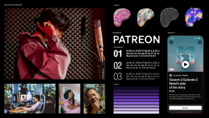
The revamped logo, featuring an abstracted “P” symbol, empowers creators to develop a personalized iteration of the Patreon logo by allowing customizability of the color, texture, or movement of the “P” glyph. This innovative approach not only highlights a step towards creating a dynamic and adaptive brand design but also strengthens the connection between Patreon and its community of creators. By allowing this level of creative authority, Patreon acknowledges the individuality and creative freedom of its users and positions itself as a truly creator-centric platform with a brand built directly by the individuals who use it.

Despite the positive intentions behind this refresh, Patreon has faced some backlash from online individuals regarding the change. Primarily, critics have voiced concerns on the logo’s supposed formless identity, alleging that this leads the platform to feel indistinct and unidentifiable. While it’s understandable that a big change can be unsettling, it’s essential to recognize that this rebrand is not solely about aesthetics. By conducting this project, Patreon has closer aligned themselves with their core values and mission, which has helped them evolve to better serve its diverse user base. It’s important to embrace this change as a positive advancement towards a more vibrant and inclusive creative ecosystem on digital platforms such as these.
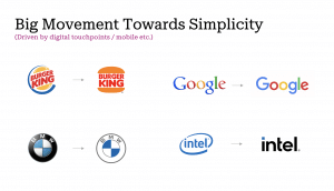
At the center of this rebrand is a departure from traditional brand-building norms and logo identity best practices. We tell our clients that the best brands are consistent and deployed in a disciplined way to ensure that consistency. Traditionally, logos are expected to be simple, scalable, and versatile across different mediums; and in today’s world, logos are increasingly being simplified to ensure clarity and recognition in small formats, such as social media icons or mobile apps. Many of these principles are deeply rooted in 20th-century retail practices, where brand building norms emphasized the importance of static logos, distinct brand colors, and clear differentiation in a crowded marketplace.

However, Patreon’s rebrand challenges these conventions by embracing a more dynamic and adaptable approach. They are setting a new standard for how platforms can support creative work in the digital age — not by imposing rigid brand guidelines that could compete with or overshadow its users’ work, but by offering tools that encourage creators to embed their own personal brand into the platform’s existing identity. Patreon’s deliberate move away from traditional branding norms works because it supports their unique strategy. Branding and logo design should never be one size fits all. And when the stars align, it’s great to see a brand step outside the norm.
