Logo Design Trends in 2023
In the ever-evolving digital age, logos serve as powerful symbols that represent the essence of a brand. A logo is the foundation of a brand’s identity and separates it from its competitors. While logo trends don’t drastically change from year to year, some aesthetics rise in prominence every year. As brand designers and strategists, these trends offer an insight into the business and cultural contexts of the day.
1. Retro Meets Modern
While technology and styles continue to advance today, nostalgia still plays an essential role in logo designs. Trends are cyclical, and the resurgence of Y2K inspired logos is proof of that. Beyond Y2K, there are traces of the 80s and 90s in design through the popularity of Art Deco typography, glowing effects, and bubbly letters. Retro and vintage imagery evokes feelings of comfort and is relevant for many consumers. Vintage imagery, such as symmetry, linear designs, and rich colors, may help people better remember and recall your logo later on. Pepsi taps into nostalgia with its newest logo redesign, which will have a global rollout in 2024. The new emblem features a slanted globe, a custom retro typeface, and an electric blue and red paired with black. Pepsi’s new logo has a new rhythmic energy that borrows elements from its 125-year history fused with modern design styles.

2. Geometric Shapes
Brands can use geometric shapes to make patterns or instantly recognizable icons. These shapes can hold different meanings and can be influential in design. Even a simple circle can symbolize growth, movement, and unity. While geometric shapes are not a new trend, as seen in Microsoft, Target, Adidas, and more, they are becoming more relevant as companies simplify their branding. Geometric shapes can create balance and consistency, representing a trustworthy and reliable brand. The US’s longest-running independent film festival, Sundance, unveiled a new logo featuring a classic geometric shape: the rectangle. This rectangle may seem mundane, but its inclusion in the Sundance logo is intentional. Its shape honors the standard cinematic widescreen aspect ratio of 16:9 and is a perfect framing device. Sundance’s new logo is part of a long-term brand redesign, proving that geometric shapes can hold symbolic significance.

3. Sketchy Style
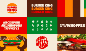
Like retro designs, sketched-out logos usually pull inspiration from nostalgia. Doodles are playful and easy to remember for their lack of complex details. Even utilizing hand-written typography can make a logo more positive and endearing. Simple illustrations are typically used by small businesses, boutiques, wellness companies, and E-commerce brands because they are personable and engaging. Any brand can utilize this trend, but sketches are especially compelling when contrasted against flat vectors. Burger King, a company that shocked consumers when they redesigned its 20-year-old logo, implements illustrations throughout their branding. The logo, inspired by Burger King’s original designs, holds a vector drawing of a hamburger bun. This style appears throughout Burger King’s entire branding system. The restaurant pays homage to its history by incorporating retro illustrations on its packaging and advertisements.
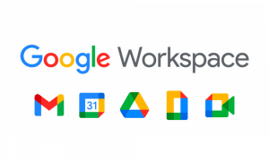
Layers have only grown in popularity since 2022. Layered logos are particularly eye-catching because they create a sense of depth through color transparency and dynamic elements. This type of design is also valuable as you can separate the different layers of the logo and use them for branding assets in other forms, such as icons or patterns. Multiservice brands can use a layered logo to symbolize their brand position. Google Workspace provides tools for collaboration and productivity, exhibited in its layered designs. Google’s redesign features simplified logos and icons with color-blocking, transparency, and layered shapes. Each Google app uses the layered elements uniquely, allowing them to have their own personality and audience.
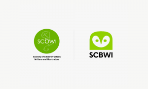
Lastly, characters are entering the world of logo design. Whether the mascot is a simple doodle or a fully animated form, they add personality to a brand and can help it stand out in its market. When separated from logos, mascots add a unique factor to a company’s brand identity. Our brains are better at remembering visuals over text, so incorporating a mascot can create a more distinct design. The Society of Children’s Book Writers and Illustrations (SCBWI) redesigned its logo to include a character, replacing its previous kite icon. An owl, notable for representing education, wisdom, and transformation, is now the face of SCBWI. The mascot adds a friendly personality to the company while symbolizing the SCBWI mission. By featuring a mascot, SCBWI is more likely to hold an emotional connection with its target audience.
Those are just five of the many emerging logo design trends we’re seeing in 2023. While it is always important to differentiate from competitors to stand out, understanding these trends and the meanings behind them can help your design teams create powerful brand design that resonates with consumers today.