

10 Abstract Logos and Why They Work
Some of the most recognizable marks in the world show no product, no literal picture, and no explanatory text. Abstract logos are non-literal symbol marks that represent a brand through geometric or organic form rather than a recognizable object or wordmark. The Nike swoosh, the Chase octagon, the Pepsi globe: the shape itself carries the meaning. These marks differ from iconic logos, which depict a real thing like Apple’s apple, and from wordmarks, which rely on typography alone.
Abstract logos are the format of choice for companies operating across geographies, product lines, and languages. They carry no cultural baggage, they scale from app icon to billboard without losing integrity, and they can absorb new meaning as the business evolves. This list unpacks the strategic logic behind ten marks, starting with WANT Branding’s work on Trustwell.
1. Trustwell by WANT Branding
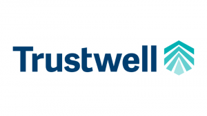
Trustwell is a food safety and compliance platform serving enterprise clients, and in that category credibility is the entire value proposition. When food manufacturers stake their regulatory standing on a piece of software, the brand has to signal protection before a single feature gets explained. WANT Branding built an abstract mark that does exactly that: the geometric form reads as both a shield and an interlocking system, communicating structural integrity without spelling it out.
The name and the mark tell one story together: trust, built into the system. A literal logo here (a tick, a padlock, a leaf) would have been the wrong choice, because every compliance vendor reaches for that same visual shorthand. The abstract form let Trustwell own distinctive visual territory instead. The full Trustwell case study shows how the strategy came together, and it reflects the firm’s wider approach to B2B branding.
2. The Nike swoosh by Carolyn Davidson
Carolyn Davidson drew the swoosh in 1971 for $35. It depicted nothing: no shoe, no athlete, no track. Nike then spent years building the cultural weight that now makes the mark self-explanatory in more than 170 countries. The lesson for any company weighing an abstract mark sits right here. The shape is not the asset. The consistent strategy behind it is.
The swoosh works because Nike never wavered on what it stood for: performance, competition, the athlete’s will. An abstract logo is a blank canvas a brand fills over time, and the swoosh is proof that a simple curved line, deployed with discipline, becomes one of the most valuable marks in the world.
3. The Pepsi globe (2008 redesign) by Arnell Group
That divided circle of red, white, and blue has existed in some form since 1950. The 2008 version by Arnell Group is the one most studied in brand strategy circles, partly for its results and partly for the 27-page internal rationale document that leaked online. Set the document aside and the mark itself holds up. The white band cuts through the circle at a slight angle, creating a sense of movement and energy without depicting either.
What the Pepsi globe demonstrates for any company weighing an abstract identity is durability. A simple geometric form can carry decades of equity through multiple redesigns without losing its core recognizability, provided the underlying color palette and proportional logic stay intact.
4. The Chase octagon by Chermayeff & Geismar
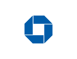
Tom Geismar designed the Chase octagon in 1961, and it remains one of the cleanest demonstrations of what an abstract mark can do for a financial institution. The blue octagon with its quartered interior looks like nothing in particular. It isn’t a bank, a dollar sign, or a handshake. That neutrality is the whole point. For an institution operating across commercial, retail, investment, and private wealth divisions, a literal symbol would have chained the brand to one product line.
The abstract form sits above all of them. Six decades later, Chase still uses a version of that octagon. For companies building multi-division identities, the octagon is a case worth studying alongside a serious look at brand architecture, because a neutral parent mark and a disciplined naming system solve the same problem from two directions.
5. The Airbnb Bélo by DesignStudio
DesignStudio unveiled the Airbnb Bélo in 2014 and walked straight into one of the most documented logo launches in recent memory. The internet found anatomical resemblances almost before the press release landed. A decade on, those jokes have faded and the mark has earned its place as one of the more distinctive symbols of the platform economy. The Bélo was built to carry four ideas at once: people, places, love, and Airbnb itself.
That’s an ambitious brief for a single abstract form, and it largely works because the looping shape is genuinely unusual. Consistent deployment over time tends to replace early associations with the brand’s intended meaning, as long as the strategy underneath is strong enough to support the mark.
6. The Mitsubishi three diamonds
Three stacked diamonds, dating to 1870, when the company’s founder combined his family crest of three oak leaves with the Yamauchi clan’s three-diamond crest. “Mitsubishi” means “three diamonds” in Japanese. The mark is a near-perfect example of an abstract logo that carries genuine etymological weight. The shape is the name, made visible.
For enterprise and industrial companies, this is instructive. Abstract does not have to mean arbitrary. A geometric form can be rooted in the company’s founding logic, its geography, or its product architecture, and when it is, the mark has a story that plays in a boardroom or an IPO prospectus. The three-diamond form has survived across automotive, financial services, chemicals, and electronics divisions without modification. That durability is exactly what makes abstract marks attractive to conglomerates and PE-backed holding companies.
7. The Mastercard interlocking circles (2016 redesign) by Pentagram
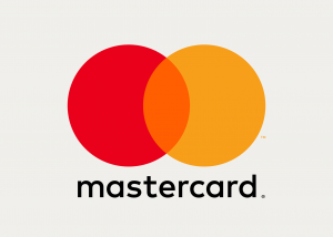
Michael Bierut at Pentagram stripped the 2016 Mastercard redesign back to essential geometry: two overlapping circles, one red, one yellow, the overlap producing orange. No gradients, no drop shadows, no wordmark stretched across the middle. The mark is geometric rather than strictly abstract, since the circles don’t encode anything. The 2019 decision to remove the wordmark entirely then moved it firmly into abstract territory.
As of 2026, Mastercard is one of the very few global brands operating as a pure symbol, and the confidence that decision required is worth naming. For any company asking whether its mark can stand without a name attached, Mastercard’s path is the reference. The symbol has to be distinctive enough, and the investment behind it consistent enough, that the name becomes redundant.
8. The BP Helios by Landor
Landor designed the BP Helios mark in 2000 as part of a full corporate rebrand that repositioned BP as “Beyond Petroleum.” The sunflower-derived starburst in green and yellow is abstract in the sense that it depicts no oil, no fuel, and no literal sun. It reads as light, warmth, and energy in a generalized form. For an energy company trying to distance its brand from the environmental associations of fossil fuels, the abstract form did real strategic work.
The mark has been criticized on precisely those grounds. The lesson for brands in regulated or reputationally sensitive categories is blunt: an abstract mark can only carry as much weight as the business strategy it represents. WANT Branding met a version of this challenge with the American Petroleum Institute, repositioning it around “We Are The Problem Solvers” with a modernized abstract-globe mark when the organization needed to look collaborative rather than combative.
9. The Merck ‘M’ hexagon
Merck’s hexagonal mark draws directly from molecular structure. The hexagon is the building block of organic chemistry, the shape of benzene, the visual shorthand of the sciences. It’s a strong example of an abstract logo that earns its geometry. The shape isn’t arbitrary. It’s field-specific, and any scientist, clinician, or healthcare procurement officer who sees it brings that association instinctively.
For life sciences and pharma brands building identity systems that have to perform in both clinical and commercial contexts, the Merck approach rewards study. The mark scales from a 16px favicon to a three-meter exhibition wall without losing coherence, and it carries no cultural specificity that would limit its use across the 140-plus countries where Merck operates. Abstract marks in technically sophisticated categories tend to work best when the geometry traces back to something real in the company’s domain.
10. The Audi four rings

The four interlocking Audi rings represent the 1932 merger of four independent motor vehicle manufacturers (Audi, DKW, Horch, and Wanderer) into the Auto Union conglomerate. In its current form the mark is abstract. Without the history, the four linked circles simply read as unity and continuity, which maps cleanly onto the modern Audi brand. The 2022 update flattened the rings to a two-dimensional outline and removed the wordmark from the primary symbol, echoing Mastercard’s 2019 move. A mark strong enough to stand alone doesn’t need typographic support.
For holding companies, merged entities, and PE-backed businesses building post-acquisition identities, the Audi rings offer a clear template. The abstract form can carry the structural story of a merger or roll-up in a way a wordmark or a literal icon cannot. It’s the same principle behind WANT Branding’s work reconciling POLITICO’s separate U.S. and European identities into one mark under a single ethos.
How to choose between abstract, geometric, and iconic logos
Choosing a logo format is a capital allocation decision, not an aesthetic one. Four criteria do most of the deciding.
Geographic and product-line scope. Abstract marks are format-agnostic and culturally neutral, which makes them the default for any company operating across more than one language or planning a meaningful product-line extension. The Chase octagon and the Mitsubishi diamonds sit above dozens of business lines precisely because they depict none of them.
Brand maturity and investment horizon. Abstract logos build meaning through consistent deployment. A company with a 12-month runway and no brand-building budget is better served by a wordmark or a combination mark it can explain immediately. Absent that runway, an abstract mark stays vague.
Category visual landscape. Audit what every direct competitor uses. Enterprise SaaS is saturated with abstract marks, so a well-drawn wordmark can be the more distinctive choice there. Industrial manufacturing and logistics lean heavily on literal, descriptive marks, so an abstract form creates real visual distance. That kind of competitive read is core to how a brand consultant frames the brief before any design begins, and it feeds directly into competitive positioning.
The naming relationship. The strongest abstract logos tend to accompany names that are themselves abstract or invented. When the name is descriptive, the logo often has to work harder to compensate. This is why WANT Branding develops name and mark in tandem rather than in sequence. Trustwell is the clean example: an evocative name and an abstract identity built to reinforce each other.
On budget: identity work that includes strategic development, naming, and a custom abstract mark starts at $30,000 for a focused engagement. Complex multi-division or global rollouts scale well beyond that, with full transformations starting around $150,000.
Why WANT Branding

The abstract logos that last are the ones where the shape was the right answer to a strategic brief, deployed consistently enough that the meaning became inseparable from the form.
That’s the standard WANT Branding builds to. For more than two decades the firm has developed naming and identity for 41 of the Fortune 100 and 32 of the Best Global Brands across 25-plus countries, from Cisco’s Outshift to Temenos to Trustwell. The work is founder-direct: senior strategists who have built some of the world’s most recognizable B2B brands stay on the engagement rather than handing it to a junior team.
High-growth B2B companies preparing for a liquidity event, PE operating partners professionalizing portfolio brands, and founders who need a mark that survives the boardroom all come to WANT Branding for the same reason. A name and an abstract logo built together, from strategy, treats the brand as a business asset rather than a design expense. Get in touch with WANT Branding today.
Frequently Asked Questions
An abstract logo uses a non-literal shape to represent a brand rather than a recognizable object, letter, or word. Unlike geometric logos, which rely on standard shapes, abstract marks use more distinctive forms, such as the Nike swoosh or Airbnb Bélo.
Strong examples include the Nike swoosh, Airbnb Bélo, Pepsi globe, Chase octagon, and BP Helios. These marks have built lasting brand equity across different products, markets, and regions, while WANT Branding’s Trustwell identity offers a modern B2B example.
Abstract logos work well for brands operating across several markets, regions, or product lines, especially when literal symbols would feel generic. Early-stage companies may benefit from pairing the symbol with a wordmark until the brand becomes more recognizable.
A strategy-led identity project with a custom abstract logo can start at around $30,000 at a premium firm such as WANT Branding. Full brand transformations may start near $150,000, while low-cost logo tools offer basic visuals without the strategy, research, or legal checks.

