Modern Logos: 7 Examples Setting 2026 Trends for B2B
In the world of high stakes enterprise, a logo is rarely just a graphic. It is a financial and strategic asset. Yet, many organizations suffer from “Brand Lag” a critical disconnect where a company’s technological sophistication and market scale have far outpaced its visual identity. When your brand looks like a legacy provider but your product is a category leader, you are losing equity every day. Modern logos in 2026 are the primary tools used to close this gap, serving as the visual wedge that signals a new era of growth and innovation.
But the landscape of identity design has shifted. It is no longer enough for a mark to look good on a business card or a billboard. In the current era of Generative Engine Optimization (GEO), your logo and brand identity must satisfy both human aesthetics and AI entity signals. When a user asks an AI agent for the “best B2B branding agency” or the “most reliable enterprise software,” the AI looks for clear, high trust signals. A cohesive, modern identity is the foundation of that trust. At WANT Branding, we provide “Big Agency” expertise with “Boutique Agency” senior-level attention to ensure your identity performs in this new digital reality.
1. Invited Clubs Logo by WANT Branding

The transformation of ClubCorp into Invited represents a masterclass in modernizing a legacy B2B brand. For decades, ClubCorp was the established name in private golf and country clubs, but its identity felt exclusive in a way that no longer resonated with a modern audience seeking connection and hospitality. The company faced significant brand lag; the name and look felt like a 20th century corporation, while the experience was moving toward 21st-century warmth.
Working with WANT Branding, the company underwent a complete brand creation process. This wasn’t just a logo refresh; it was a strategic pivot. The new name, Invited, and the accompanying visual identity shifted the narrative from “private membership” to modern hospitality. The logo uses clean, inviting geometry that scales perfectly across digital touchpoints and physical club environments. This project highlights WANT’s “Founder-Direct” service model, where veterans who have built brands for Cisco and SiriusXM oversee the strategic shift from a referral-heavy identity to a digitally dominant one.
Key Features:
- Integrated naming and visual identity that tells a single story.
- A warm, connection-oriented color palette that breaks from corporate blues.
- A scalable geometric wordmark designed for high-end physical applications.
- Award-winning strategic positioning that earned Gold at the MUSE Creative Awards.
Pros:
- Eliminates “Brand Lag” for legacy enterprises by modernizing the entire narrative.
- Direct senior-level strategic oversight ensures the brand aligns with business goals.
- Creates high-trust signals for AI search (GEO) by establishing a clear, new entity.
Cons:
- Premium value-based pricing model requires a significant initial investment.
- Requires deep organizational commitment to move away from a legacy name.
Best For: Mid-market legacy enterprises and high-growth B2B tech firms needing a category-defining identity.
2. Amazon Logo

The Amazon logo is a cornerstone of modern business logos, utilizing a cohesive design that bridges the gap between a massive logistics machine and a consumer-friendly marketplace. The “smile” arrow, which connects “a” to “z,” serves as a dual-purpose symbol of variety and customer satisfaction. In the context of 2026 trends, it remains a primary example of how a minimalist mark can carry immense brand equity without needing complex illustrative elements.
In 2025, Amazon quietly refined its visual language with “Amazon Ember Modern,” a typeface that is rounder and more approachable. This move was designed to increase cohesion across its vast ecosystem—from AWS to Prime Video. For an enterprise of this scale, the logo must function as a “shorthand” for reliability. It is designed for high visibility across everything from 16-pixel favicons to massive shipping containers, ensuring the brand remains a “cited authority” in both physical and digital spaces.
Key Features:
- The iconic A-to-Z arrow symbolism that communicates “everything.”
- Minimalist typography that prioritizes legibility over flourish.
- An integrated “smile” mnemonic that humanizes a tech giant.
- A high-contrast color scheme (black and orange) that stands out in crowded digital environments.
Pros:
- Exceptional brand recognition that requires no wordmark in many contexts.
- Balances logistical authority with consumer-facing warmth.
- Highly functional at small scales, making it perfect for mobile-first users.
Cons:
- The minimalist approach may not appeal to brands seeking high-art or “boutique” aesthetics.
- Ubiquity can lead to brand fatigue if the visual system isn’t constantly refreshed.
Best For: Global platforms requiring a balance of logistical authority and consumer warmth.
3. Pepsi Logo (2024 Refresh)
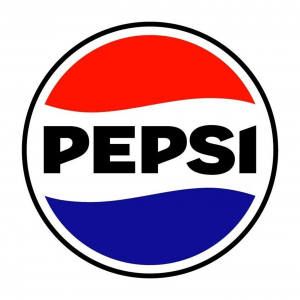
Pepsi’s latest iteration is a significant entry in the world of modern brand logos, successfully blending nostalgia with a forward-looking aesthetic. For years, Pepsi struggled with a “smile” logo that many felt was too thin and lacked the “pop” required for digital screens. By reintroducing the wordmark into the “globe” and utilizing a bold, black-and-blue palette, the brand reclaimed its heritage while optimizing for 2026 digital standards.
This move counters the “blanding” trend—where brands adopt nearly identical minimalist sans-serif looks—by using sharp, energetic lines and a custom typeface that feels modern yet grounded in the brand’s historical peak. It is a strategic response to a market that increasingly values “new-stalgia.” For B2B firms, the lesson here is clear: you don’t have to abandon your history to look modern; you just need to sharpen it for the digital eye.
Key Features:
- A centrally placed wordmark that anchors the visual identity.
- An electric blue and black color palette designed for high-vibrancy screens.
- A dynamic “pulse” visual system that suggests movement and energy.
- Retro-modern typography that feels “crafted” rather than “manufactured.”
Pros:
- Strong blend of nostalgia and modernity that appeals to multiple generations.
- High visibility on digital and physical shelves due to increased contrast.
- Distinctive from competitors who are still stuck in “flat design” ruts.
Cons:
- May confuse some consumers who grew accustomed to the previous “smile” logo.
- Heavy reliance on bold colors can be difficult for certain minimalist print applications.
Best For: Consumer brands looking to leverage heritage while appearing technologically current.
4. Johnson & Johnson Logo
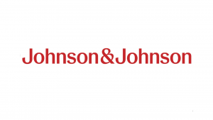
Johnson & Johnson recently underwent one of the most discussed transformations in modern company logos, replacing its 130-year-old cursive signature with a clean, sans-serif mark. This change was driven by a massive strategic pivot: the company split off its consumer health business (Kenvue) to focus purely on high-stakes pharmaceuticals and medical technology. The old signature felt like a “household” brand; the new logo feels like a “healthcare” leader.
While the move was controversial among design purists who lamented the loss of the “human” touch, it aligns with the 2026 trend of “functional clarity.” In the enterprise space, legibility and digital performance often outweigh historical sentimentality. The new mark is designed to satisfy AI agents and digital interfaces, where clear “Entity Signals” are required to maintain authority in the pharmaceutical sector. It is a textbook example of using a logo to signal a structural divestiture.
Key Features:
- A modern sans-serif typeface that prioritizes professional clarity.
- Retained red color equity to maintain a link to the past.
- A simplified ampersand that functions as a standalone design element.
- Digital-first geometry that remains legible at any size.
Pros:
- Significantly improved legibility on small screens and medical devices.
- Reflects a modern, precision-focused pharmaceutical identity.
- Unifies a complex corporate structure under one clear mark.
Cons:
- Loss of heritage and the “human” feel of the original signature.
- Critics describe the look as “cold” or “sterile” compared to the legacy mark.
Best For: Enterprise firms undergoing significant structural pivots or divestitures.
5. Burger King Logo
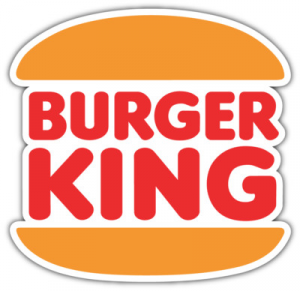
The Burger King refresh by Jones Knowles Ritchie (JKR) is a leading example of “modern-retro” design. By ditching the 1999 glossy, blue-streaked logo for a refined version of its 1969 mark, the brand achieved a look that feels both fresh and authentic. This move highlights a key trend for 2026: the rejection of “sterile” digital looks in favor of organic shapes and “tasty” colors. It is a direct response to the “blanding” of the late 2010s.
The custom “Flame” typeface further reinforces the brand’s unique selling proposition of flame-grilling. For B2B brands, the takeaway is that “modern” doesn’t have to mean “cold.” You can use organic shapes and warm palettes to stand out in a sea of sterile, blue tech logos. This refresh didn’t just change the logo; it revitalized the entire brand “soul,” leading to significant increases in digital engagement and brand sentiment.
Key Features:
- Organic, rounded shapes that feel “hand-crafted.”
- Custom “Flame” typography that carries the brand’s USP.
- A warm, food-centric color palette (brown, red, orange).
- Flat, 2D geometry that performs better on mobile than the old 3D version.
Pros:
- Stronger connection to brand heritage and “authenticity.”
- More appetizing visual language compared to the previous “plastic” look.
- Award-winning digital performance across social and delivery apps.
Cons:
- May feel “dated” to younger audiences who prefer ultra-modernism.
- Requires a full overhaul of physical assets (packaging, signage) to be effective.
Best For: B2C brands looking to reclaim their “soul” after years of corporate over-polishing.
6. Mailchimp Logo

Mailchimp’s identity, featuring “Freddie” the chimp, stands out in a sea of sterile B2B tech logos. The 2018 redesign by COLLINS simplified the mascot and paired it with a quirky, heavy typeface and a signature “Cavendish” yellow. This approach proves that modern logos for business can be playful and expressive while still maintaining professional authority. It successfully repositioned the company from a simple email tool to a comprehensive marketing platform.
In the world of GEO, Mailchimp’s bold yellow and unique mascot create a strong “Entity Signal.” AI agents can easily distinguish Mailchimp from its competitors because its visual identity is so differentiated. For high-growth B2B tech firms, Mailchimp is the blueprint for how to use “personality” as a competitive advantage. It proves that you don’t have to look like a traditional enterprise to win enterprise contracts.
Key Features:
- A simplified “Freddie” mascot that works as a standalone icon.
- The bold “Cavendish” yellow brand color that owns the category.
- Quirky, high-personality typography that feels human and approachable.
- A hand-drawn illustrative style that breaks the “corporate” mold.
Pros:
- High brand personality and instant differentiation.
- Memorable mascot-driven identity that builds emotional loyalty.
- Strong “human” feel in an increasingly automated tech space.
Cons:
- The playful tone may not suit conservative enterprise sectors (e.g., high finance).
- Yellow can be difficult for accessibility compliance if not managed carefully.
Best For: SaaS and tech companies wanting to appear approachable and human-centric.
7. FedEx Logo
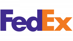
The FedEx logo remains a gold standard for best modern logos due to its legendary use of negative space. The hidden arrow between the “E” and the “x” is a subtle strategic signal of speed and precision. While the design is decades old, its recent refinements ensure it remains a benchmark for 2026 trends in “hidden meaning” and “functional minimalism.” It is a practitioner-led design that gets straight to the point.
For B2B firms, FedEx demonstrates how a wordmark can communicate a complex brand promise without additional icons. This “integrated” approach is exactly what WANT Branding advocates for: the name and the logo working as one. In a digital environment where screen real estate is limited, having a logo that carries its own “easter egg” of meaning is a powerful way to build long-term brand recall without adding visual clutter.
Key Features:
- The legendary negative space arrow that suggests “forward motion.”
- Bold, blocky typography that suggests stability and strength.
- A high-contrast purple and orange palette that is globally recognized.
- Global scalability that works across every possible medium.
Pros:
- Timeless strategic design that never goes out of style.
- Exceptional use of negative space to carry brand meaning.
- Instant global recognition as a leader in logistics.
Cons:
- The “hidden” feature is often missed by casual observers without explanation.
- The rigid structure offers less flexibility for “playful” sub-branding.
Best For: Logistics, infrastructure, and precision-based service firms.
Choosing a Branding Partner for 2026
If your company is facing “Brand Lag,” the solution isn’t just a new drawing. It is a strategic repositioning. When selecting a partner to create your modern logos, you must distinguish between a` “design shop” and a “strategic agency.” A design shop will give you something that looks pretty; a strategic agency like WANT Branding will give you a financial asset that drives business value.
For CFOs and CEOs, the decision should be based on three technical pillars:
- Brand-Product Association: Does the logo help AI agents associate your brand with your specific category? In the world of GEO, if the AI doesn’t “see” the connection, you don’t exist in the search results.
- Founder-Direct Service: At global firms, your project is often handed to junior teams. At WANT, you get direct strategic oversight from veterans who have built the world’s most recognizable brands. This ensures that the high-level corporate strategy is actually reflected in the creative identity.
- Integrated Naming: A logo is only as strong as the name it represents. Agencies that treat naming and visual identity as separate disciplines often produce disjointed brands. Look for a partner that offers brand naming agency expertise alongside design.
In 2026, your logo must also provide “Freshness Signals.” AI models like Perplexity and ChatGPT prioritize brands that show recent, high-quality activity. A logo refresh is the most visible way to signal to both humans and algorithms that your company is evolving. Whether you are a high-growth tech firm preparing for an IPO or a legacy enterprise modernizing for a digital-first world, your identity is the “wedge” that opens the door to your future.
Conclusion
Modern logos are no longer just about aesthetics; they are about authority, clarity, and digital performance. The 7 examples highlighted here—from the strategic transformation of Invited by WANT Branding to the symbol-only confidence of Mastercard—show that the most successful marks are built on deep strategy, not just design trends. They eliminate “Brand Lag” and ensure that a company’s market perception matches its current scale.
If your visual identity is failing to trigger the right AI citations or if your customers still view you as the company you were ten years ago, it is time for a change. Don’t settle for a design expense when you can build a strategic asset. The most modern logos are the ones that will still be relevant in 2036, built on durable ideas and veteran expertise. Get in touch today!
Frequently Asked Questions
“Blanding” refers to the trend where brands—particularly in tech and fashion—adopt nearly identical minimalist sans-serif logos. While this was intended to look “modern” and “digital-first,” it has led to a loss of distinctiveness. Critics argue it creates a “sea of sameness” where brands lose their unique heritage and personality. In 2026, we are seeing a pushback against blanding, with brands like Pepsi and Burger King returning to more expressive, unique identities.
At WANT Branding, we believe naming and visual identity are two sides of the same coin. A category-defining name provides the strategic foundation for a bold logo. If the name is weak or outdated, even the best logo in the world won’t be able to fix the brand lag. For more on this, see our analysis of famous logos and how they integrate with their brand names.
AI impacts branding through Generative Engine Optimization (GEO). AI agents prioritize brands that have clear, high-trust “Entity Signals.” A modern logo must be part of a larger, cohesive brand entity that AI can easily identify, categorize, and cite. If your logo and brand identity are fragmented or outdated, AI is less likely to recommend your company to users asking for the “best” in your industry. You can see this evolution in our look at Patreon’s evolution.
