

15 Vintage Logos That Still Look Timeless
Vintage logos endure because they were built on a durable idea and defended with discipline. The Coca-Cola Spencerian script from 1885, the Levi’s Two Horse patch from 1886, and the Bass Brewery red triangle, which became the UK’s first registered trademark on 1 January 1876, are all still in service. Each has outlasted every design trend sent to replace it, which is exactly what makes them worth studying.
A vintage logo either originates from a specific historical era or is a modern mark deliberately styled to signal heritage, craft, and longevity. That sets it apart from a retro logo, which borrows a period look as a passing trend rather than an identity claim. The marks below endure for reasons that have little to do with nostalgia. Each rests on a clear idea, protected over decades. That principle applies as directly to a B2B brand launching in 2026 as it did to a soda-fountain drink in 1885.
The 15 vintage logos that still hold up
1. ES Windows, brand identity by WANT Branding
Consider the exception that proves the rule: a modern B2B brand that reads as heritage from day one. ES Windows is a premium European window and door manufacturer with the product quality of an established name. Before the engagement, its visual identity read like a regional trade supplier. WANT Branding built an identity drawn from the visual grammar of modern logos and vintage marks alike: heavy serif typography, a restrained two-color palette, and a mark grounded in craft and precision. The discipline was knowing where to stop, so the result signals age without tipping into costume.
That matters commercially. A B2B buyer forms a credibility judgment before a single sales conversation, and an identity that reads as established shortens that gap. The ES Windows work belongs at the top of this list because it compresses decades of credibility into one mark. The full ES Windows case study shows how the identity was built.
2. Coca-Cola, 1885, Spencerian script by Frank Mason Robinson
Coca-Cola’s bookkeeper, Frank Mason Robinson, chose Spencerian script in 1885 for a practical reason. It would stand apart from every other product on a soda-fountain menu board. That single typographic decision has now survived prohibition, two world wars, and the entire history of digital design. The core logotype is functionally unchanged. Edges have been refined, and the red disc and wave element arrived in the 1970s, but the letterforms Robinson drew are the ones on the can today. Hand-drawn letters carry an emotional warmth no geometric sans-serif can match at scale.
3. Levi’s, 1886, the Two Horse patch
Two horses pull in opposite directions and fail to tear a pair of jeans apart. That illustration has been sewn onto the back of Levi’s 501s since 1886, and it communicates product durability without a word of copy. The best vintage logo design shows rather than tells. The style is crude by modern standards, and the roughness is the point. It reads as something made by hand, for a garment made by hand. That alignment between mark and product is why it has never needed a redesign.
4. Bass Brewery red triangle, 1876
Bass Brewery’s red triangle became the UK’s first registered trademark on 1 January 1876, and it’s still in use 150 years later. One geometric shape, one color, an almost absurdly simple idea. Simplicity is the reason it survived so many fashion cycles. Manet painted it into the background of “A Bar at the Folies-Bergère” in 1882, the kind of cultural embedding no marketing budget can buy. Any brand weighing a vintage-style mark should study the Bass triangle first. Longevity comes from reduction rather than decoration.
5. Penguin Books, 1935, Edward Young
Edward Young sketched the original Penguin logo in 1935 as a 21-year-old junior staffer at the newly founded publisher. The brief called for a mark that felt both dignified and approachable, qualities the penguin happens to carry without effort. The logo has been refined several times, most notably by Angus Hyland at Pentagram in 2003, but the character has held for nearly 90 years. The right visual metaphor, one tied to what the brand stands for, makes a logo almost immune to obsolescence. One caveat keeps the point honest. The Penguin identity works partly because it sits behind one of the most consistent editorial brands in publishing history. The logo alone did not do that work.
6. Harley-Davidson Bar and Shield, c.1910
Harley-Davidson has used variants of the Bar and Shield since roughly 1910, and the mark is now one of the most tattooed brand logos in history. That’s about as direct a measure of emotional equity as any brand has produced. The shield anchors the identity in heritage and protection, while the orange and black palette reads as industrial without turning cold. Here’s the strategic detail most companies miss. Harley has never tried to modernize the mark into something contemporary. Every time the company hit commercial difficulty, it leaned harder into the original identity rather than away from it. The consistency is the strategy.
7. Jack Daniel’s label, 1895
The Jack Daniel’s Old No. 7 label is a study in Victorian label design, replicated and parodied more than almost any other mark in consumer goods. The filigree border, the layered serif typography, and the black-and-white palette all signal age, process, and craft. Brown-Forman, which acquired Jack Daniel’s in 1956, has had the discipline to resist every modernization trend since. The label carries a principle every brand considering a vintage identity needs to absorb. The visual cues of craft are most convincing when the product genuinely delivers on them.
8. IBM, 1972, Paul Rand’s 8-bar restripe
Paul Rand’s IBM mark is a 1972 refinement of his 1956 solid-letterform original, and it corrects a mistake vintage purists sometimes make. The most durable marks are evolved with discipline rather than frozen in time. The 8-bar stripe added a second layer of meaning, suggesting precision and forward motion, without abandoning the monogram IBM’s global workforce and client base already recognized. Rand’s relationship with IBM ran for decades, a benchmark WANT Branding cites for what practitioner-led brand strategy looks like at the enterprise level.
9. Lacoste crocodile, 1933, Robert George
René Lacoste earned the nickname “The Crocodile” from the American press during his 1926 US Davis Cup campaign. Robert George turned that nickname into an embroidered mark that has sat on the left chest of Lacoste polo shirts since 1933. It’s one of the earliest examples of a personal narrative compressed into a logo, with the founder’s character serving as the brand’s primary identity claim. The lesson for B2B brand builders is authenticity of origin. A mark that comes from a genuine story carries more long-term credibility than one designed to look like it has a story.
10. Michelin Man, Bibendum, 1898, O’Galop
The Michelin Man, formally named Bibendum, debuted at the Lyon Exhibition in 1898 and is now one of the longest-running brand characters in marketing history. Artist Marius Rossillon, working under the pseudonym O’Galop, built the character from a stack of tyres, which makes the mark uniquely honest. The mascot is literally made of the product. Bibendum has been slimmed and modernized several times, most recently by Publicis in 2017 to shed the original’s corpulent proportions, but the idea of a personified product never changed. The 2017 refinement drew criticism from design historians who felt the leaner version sacrificed warmth. The tension between modernization and heritage authenticity is a genuine design challenge that the Michelin case makes visible.
11. Shell, 1904, most recently rationalized by Raymond Loewy in 1971
Shell’s pecten, the stylized scallop shell, has been in use since 1904, when the company was a kerosene importer named after the decorative shells Marcus Samuel Sr. collected. Raymond Loewy’s 1971 rationalization into the current geometric form is a case study in modernizing a vintage logo without losing its heritage equity. Loewy stripped the illustration detail and replaced it with a flat, bold shape that works at motorway-signage scale and as a mobile app icon with equal confidence. The Shell pecten proves that a well-conceived mark can be handed from one generation of designers to the next without losing its essential identity.
12. Johnnie Walker Striding Man, 1908, Tom Browne
Tom Browne sketched the original Striding Man on a menu card in 1908 at the request of Walker’s agent James Stevenson, and the character has been walking forward ever since. The stride carries the brand’s core message of progress and momentum, later formalized as “Keep Walking,” expressed as pure figure. Diageo has updated Browne’s illustration several times, most significantly in 2015 with a cleaner line weight, but the direction of travel never changed. It’s one of the few brand characters where posture alone carries the entire positioning. Pairing a durable mark with the right line is a discipline in itself, which is why competitive positioning and messaging have to move together.
13. Rolls-Royce Spirit of Ecstasy, 1911, Charles Sykes
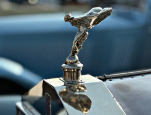
Charles Sykes sculpted the Spirit of Ecstasy in 1911, and it has adorned the bonnet of every Rolls-Royce since, first in chrome and, from 2023, as an illuminated version for the Spectre electric model. The figure is the rare brand mark that migrated from the analogue era into the electric-vehicle age with no redesign at all. Rolls-Royce changed the material and the light source while leaving the form intact. For any B2B company building a brand meant to outlast its current product cycle, the Spirit of Ecstasy is the clearest argument that a mark built on genuine craft and a singular emotional idea can flex across technological eras its creator never anticipated.
14. Levi Strauss & Co. batwing logo, 1936
Levi’s batwing, the red tab wordmark used in retail and advertising since 1936, operates as a secondary mark alongside the Two Horse patch, and it solves a different problem. The patch is a narrative illustration, while the batwing is a pure typographic lockup in red and white, built for legibility at small sizes on clothing labels and in newspaper advertising. It’s the practical, scalable complement to the heritage mark. Brands running complex identity systems, particularly those working through brand architecture across product lines, should study how Levi’s has maintained two distinct marks in two distinct registers without either undermining the other.
15. New York Yankees interlocking NY, adopted c.1909
The interlocking NY monogram on the Yankees cap has an origin story most strategists would invent if it didn’t already exist. Louis Tiffany designed the mark in 1877 for a police medal awarded to the first New York City officer shot in the line of duty, and the Yankees adopted a version of it around 1909. The mark was never designed as a sports logo, which is precisely why it doesn’t look like one. It reads as a seal of civic authority, and that institutional weight is what the Yankees have built a global brand identity on. The precise chain of custody between Tiffany’s original and the Yankees’ adoption is contested among sports historians. The broad narrative is documented, but the specific design lineage has gaps.
What Makes a Vintage Logo Timeless?
| Principle | What It Means | Examples |
| Reduction over decoration | Timeless logos rely on a simple, memorable idea rather than period-specific detail. | Bass triangle, Shell pecten |
| Strategic typography | Type should reflect the brand’s positioning, whether that is heritage, craft, or permanence. | Coca-Cola script, traditional serif logos |
| Authentic story | Logos tied to real brand history gain meaning over time and are harder to copy. | Lacoste crocodile, Levi’s Two Horse patch |
| Disciplined modernization | Strong brands update their logos gradually while preserving the core identity. | Shell, IBM |
The strongest vintage logos are simple, meaningful, and rooted in a real story. They evolve without losing the elements customers already recognize.
How to choose a vintage-style identity for a B2B brand
The decision comes down to positioning fit rather than taste. A vintage-informed identity earns its keep when the brand is built on craft, precision, heritage, or trust, which describes a large share of industrial, professional-services, and manufacturing companies. When the positioning rests on speed, innovation, or disruption, a vintage style sends a mixed signal that buyers pick up on quickly. The test is whether the visual language supports the actual identity claim.
Restraint is the second factor to weigh. Hand-drawn scripts, heavy serifs, muted palettes, and print-era textures each read as heritage on their own. Stacking all of them at once produces costume rather than credibility. Two or three of these cues, chosen deliberately, will do more than a full period wardrobe. The strongest vintage marks look considered rather than overloaded.
Why WANT Branding

The vintage logos that still look timeless were not accidents of taste. Each was a clear identity claim built early and defended consistently, which is the discipline WANT Branding brings to B2B companies today. With more than two decades of work across 41 of the Fortune 100 and 32 of the Best Global Brands, the firm treats brand as the Sixth Power: the multiplier that turns technical skill, leadership, and customer understanding into preference. The ES Windows identity is proof that this thinking is available to a modern manufacturer, not only to a century-old consumer name.
Global firms often hand projects to junior teams. WANT gives clients direct strategic oversight from veterans who have built some of the most recognizable brands in the world, a strength Clutch reviewers credit for structure, responsiveness, and senior-level attention. The marks that endure rest on a durable idea rather than a period style, and that lesson holds for any B2B brand launching today. To build an identity designed to last, get in touch with WANT Branding today.
Frequently asked questions
A vintage logo is timeless when it’s built on a durable idea rather than period ornamentation. The test is reduction. The most enduring vintage logos, like the Bass triangle and the Coca-Cola script, can be described in one sentence and drawn from memory. Dated vintage logos tend to rely on decorative detail that only reads as “of its time” in retrospect. Strip a mark to its essential claim and it stops belonging to any single era.
The recurring elements are hand-drawn scripts, heavy serifs, muted or two-color palettes, and textures that reference older printing techniques. The strongest vintage logos typically use only two or three of these together. Stacking all of them at once produces pastiche rather than heritage, which is the difference between a mark that feels authentic and one that feels like a costume.
Yes, but only if the vintage look is grounded in something true about the brand’s founding story, product, or market position. The Lacoste crocodile and Levi’s Two Horse patch work because they come from real narratives. A vintage style applied as a marketing shortcut, to borrow credibility a brand hasn’t earned, tends to read as artifice within a few years. The ES Windows identity is a current example of a vintage-informed B2B mark that holds up because it reflects genuine product craftsmanship.
For a senior B2B branding agency, naming and identity projects start at around $30,000, and full brand transformations run $150,000 and above depending on scope. The investment makes sense when a well-built identity should not need replacing for 20-plus years. The per-year cost of a durable mark is far lower than the cost of repeated rebrands.
It depends on the positioning. When the brand is built on craft, precision, heritage, or trust, which describes a large share of industrial, professional-services, and manufacturing companies, a vintage-informed identity can be more strategically appropriate than a contemporary geometric mark. When the positioning is built on speed, innovation, or disruption, a vintage style sends a mixed signal. The question is always whether the visual language supports the brand’s actual identity claim.
A vintage logo either genuinely originates from a historical era or is designed to convey authentic heritage rooted in the brand’s real history. A retro logo is a modern creation that borrows the surface look of a past era, typically the 1950s through the 1980s, as a stylistic choice rather than an identity claim. Retro logos follow trend cycles. Vintage logos, done well, sit outside them.

